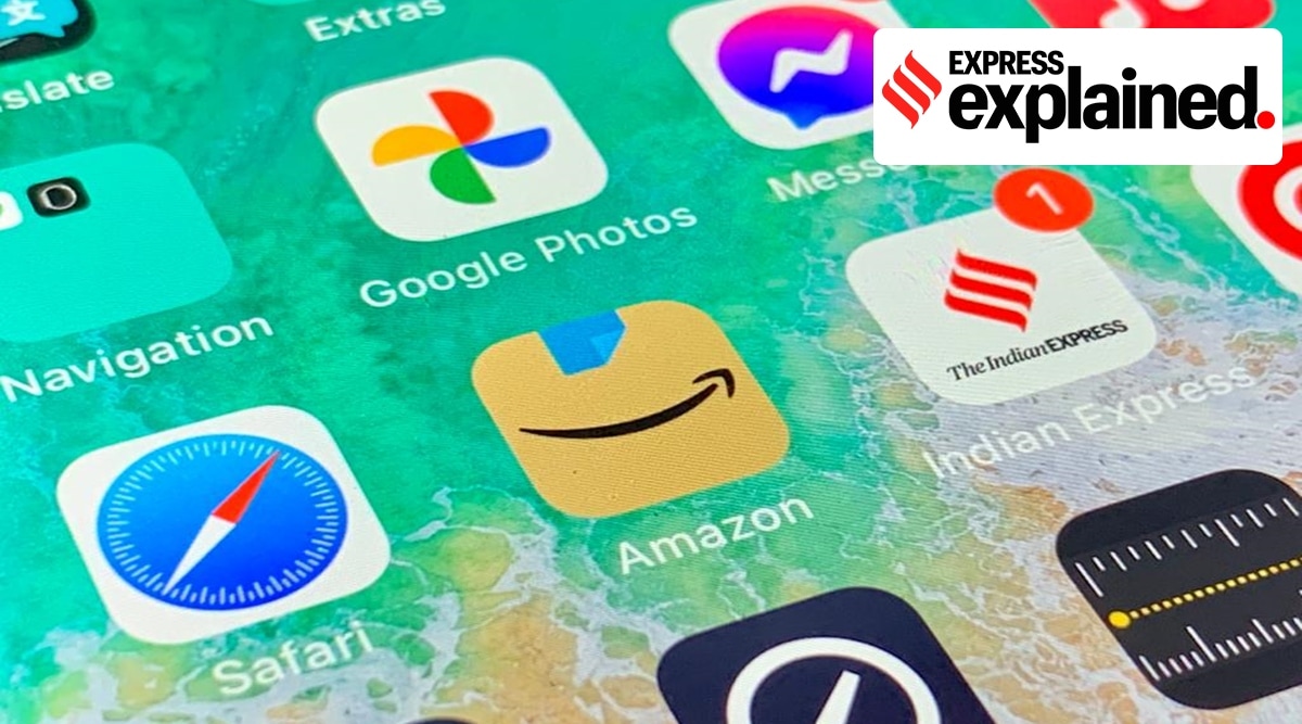
The new logo design of Amazon featured Amazon’s signature curved arrow against a brown background. Several social media users were quick to notice that the jagged edges of the blue tape closely resembled Hitler’s characteristic toothbrush moustache.
After changing its app icon for the first time in more than five years, e-commerce giant Amazon was compelled to tweak the new design just weeks later after social media users pointed out that it bore resemblance to the toothbrush moustache famously associated with German dictator Adolf Hitler.
Following customer feedback, Amazon quietly rolled out a slight update to the icon, which was first unveiled in January. “Amazon is always exploring new ways to delight our customers. We designed the new icon to spark anticipation, excitement, and joy when customers start their shopping journey on their phone, just as they do when they see our boxes on their doorstep,” a spokesperson for the company said.
Why did the new logo spark controversy?
The new logo design, which had begun to appear on several regional app stores, featured Amazon’s signature curved arrow — made to look like a smile — against a brown background, presumably inspired by the cardboard boxes used to deliver Amazon products. But it was a small blue strip of packaging tape at the top of the new logo that sparked a storm online.
Several social media users were quick to notice that the jagged edges of the blue tape closely resembled Hitler’s characteristic toothbrush moustache. “It’s not just a ripped scotch tape, it’s a ripped scotch tape that has a similar shape and is right on top of a smiling mouth. Looks like a happy little cardboard Adolf to me,” one social media user tweeted.
How did Amazon respond to the controversy?
On February 22, the company debuted its updated version of the icon on the iPhone, and on Monday, it was updated on Android. This time the blue strip was made to look like a folded over piece of tape.
“Amazon’s new iOS app logo attempt 2: now with 15% less Hitler,” a social media user tweeted. However, the company has not addressed whether the subtle design change was in response to comparison to the Nazi dictator.
? JOIN NOW ?: The Express Explained Telegram Channel
Have other brands come under fire for Nazi imagery?
Several brands have come under fire in recent years for using Nazi imagery or selling products that promote hate speech and anti-semitism. In fact, this is not the first time Amazon has run into controversy for using Nazi images. In 2015, subway trains in New York were plastered with posters for the Amazon Prime show ‘Man in the High Castle’. However, many riders complained about the posters, as they featured swastikas and other Nazi insignia.
In July last year, fast fashion retailer Shein faced backlash for selling a “metal pendant necklace” that appeared to be shaped like a swastika. Following widespread criticism, the necklace was removed from the website.
Last month, Marvel made changes to its latest issue of the Immortal Hulk comic after several readers objected to antisemitic imagery included in the story. A report in CBR.com states that the “name of the store, written in reverse in the store’s window, was ‘Cronemberg’s Jewery’, with a Star of David, a noted Jewish symbol, in the window”.
It is also not uncommon for customers to file lawsuits against companies for what they believe are offensive logos or messaging. Recently, e-commerce website Myntra was forced to change its logo after a Mumbai-based activist lodged a complaint with the state cyber police, alleging that the company’s signage was “insulting and offensive” towards women.
The complaint was lodged by a woman named Naaz Patel, the founder of an NGO called Avesta Foundation. She filed the complaint in December last year, demanding the removal of the logo and calling for action to be taken against the company. Patel alleged that the old logo resembled a naked woman.
Source: Read Full Article


